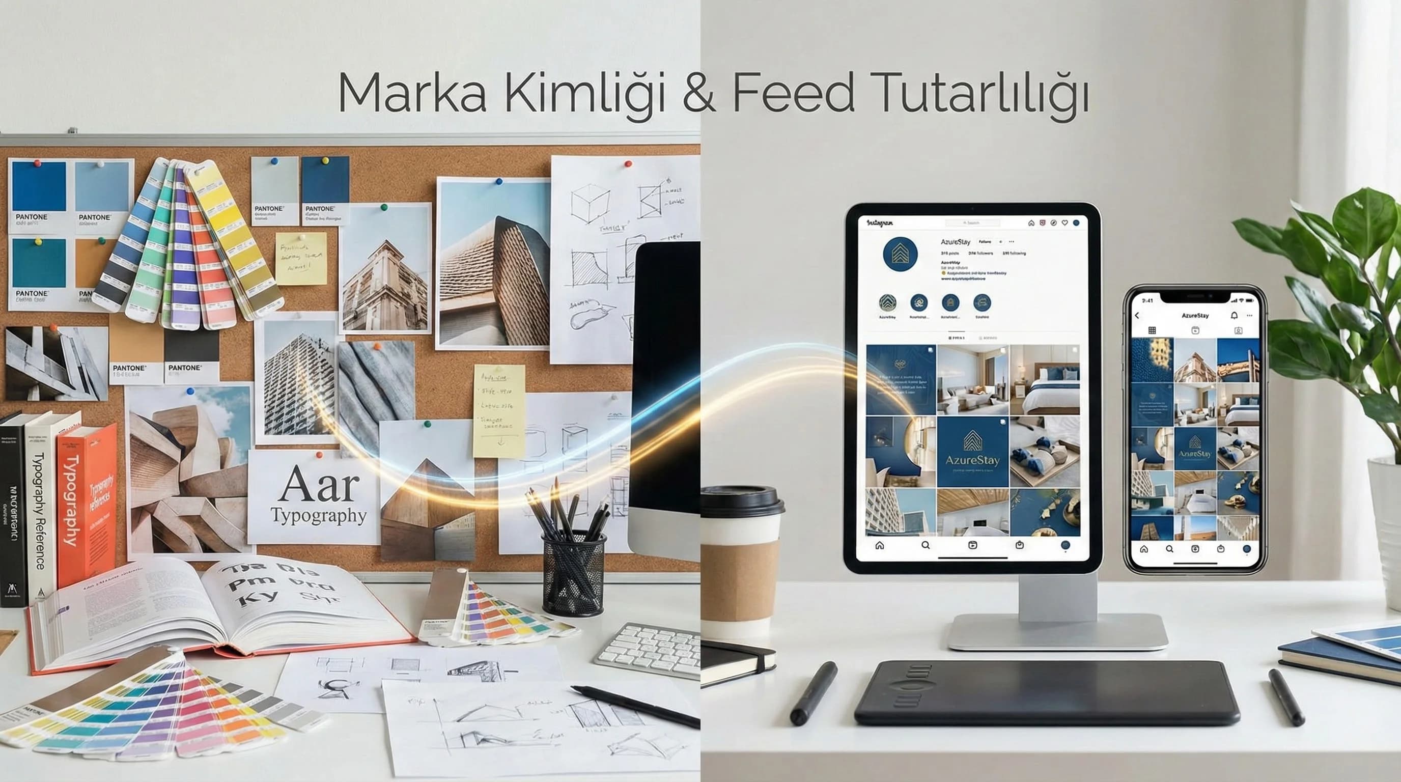
2. Color Palette, Typography and Visual Style
The first requirement for a feed to look “pro” is that the design makes few decisions: that is, the options are limited from the beginning. 18 colors, 6 fonts, 12 shadows… these do not increase creativity; increases clutter. Social media language loves small but consistent selection.
How should the color palette be chosen?
Short answer: start with 1 primary color, 1 secondary color, and 2 neutral colors (light/dark); then add 1 accent color. In hotel brands, the main color usually carries a "feeling" (sea, sun, nature). In B2B, the main color conveys “confidence and clarity” (more corporate and lower saturation).
Primary and secondary color palette
- •Main color: brand signature (CTA, title bars, icons)
- •Secondary color: section separation (label, subheading, frame)
- •Neutrals: backgrounds (white/cream + dark grey)
- •Accent: small stroke that attracts attention (label, arrow, highlight)
Typography selection (2 font rule)
Target in typography; It's not about "being different", it's about being readable. On social media, the user swipes quickly; If the text is not read in 1–2 seconds, it is skipped.
Typography rule set
- •Maximum 2 font families: 1 header, 1 body
- •Maximum 3 weights: Regular / Medium / Bold
- •Use all caps limited: in short tags (not spam)
- •Line spacing: woodwind in mobile (especially carousel)
Photo/video style guide (lighting, framing, tone)
The hotel feed is often photo-heavy; That's why "photo language" is 60% of identity. In B2B, visual language; It is established with a balance of graphics, screenshots and human-oriented content.
Photo/video style guide items
- •Light: natural and clean (no excessive filters)
- •Tone: warm/cold constant (do not create two different worlds)
- •Framing: Choose 3 fixed framing types (wide, medium, detail)
- •Human use: feeling of experience in hotel, feeling of trust in B2B
- •Cover (thumbnail): fixed template or fixed label on reels
What should I do?
- • Choose 10 reference images and define the “go-to tone.”
- • Choose 3 framing types; standardize shots accordingly.
- • Either stencil the reel covers or fix them with a uniform label.
3. Grid/Feed Design and Patterns
"Grid design" does not mean making every post the same. Grid; It means a repeating pattern: the user “reads” and recognizes the brand in the 9-way view.
Grid patterns: 3 practical models
The following patterns are the most useful and easy-to-produce systems in hotels and B2B:
1) Triple blocks (Pillar blocks)
Every 3 posts appear to belong to a pillar: • 1: informative (carousel) • 2: experience/emotion (photo/reels) • 3: social proof/CTA (comment/offer)
2) Alternation (photo – graphic – photo)
Since there is a high photo density, especially in hotels, putting “graphics/labels” in between provides order: • Photo (experience) → Graphics (FAQ) → Photo (room) → Graphics (campaign)
3) Campaign template (fixed monthly series)
The series is repeated 4 times a month: “Room of the Week”, “Experience of the Week”, “Route Suggestion of the Week”, “FAQ of the Week”.
Does feed design affect SEO and engagement?
Short answer: Indirectly, yes. Feed consistency; increases profile conversion, save/return behavior, and brand trust. This positively affects algorithmic distribution and user actions (DM, link clicks). On the SEO side, there is no direct “Instagram grid SEO”; but it has an impact on brand searches and conversion: if the user remembers the brand, he searches on Google and goes to the site.
☑ Mini Check:
- •Do at least 3 different content types appear in the 9-way grid?
- •Are color and written language in the same world?
- •Do the reel covers disrupt or complement the grid?
What should I do?
- • Choose 1 main pattern, add 1 auxiliary pattern (2 total).
- • Do not exit this pattern for 30 days; Then improve gradually.
- • Prioritize the most saved content type in the pattern.
Download Social Media Style & Feed Design Template — SMM + Creative (v1.0)
This template; It turns color palette, typography, photo/video style, grid patterns and formatting rules for social media into a one-page guide. It breaks the “redesign every post” cycle in hotel and B2B accounts, reduces revisions and rapidly increases feed consistency.
Kim Kullanır?
Hotel/group brand marketing teams, agency creative teams, social media managers.
Nasıl Kullanılır?
- Remove color/font/logo rules from existing brand guideline.
- Select 10 reference posts and define the photo/video style; Choose 2 patterns.
- Add template set for story and reels; Do not deviate from this standard for 30 days.
Ölçüm & Önceliklendirme (Kısa sürüm)
- ▢ ✅ Is there 1 main + 1 secondary + 2 neutral + 1 accent color?
- ▢ ✅ Were a maximum of 2 fonts used?
- ▢ ✅ Have the 3 framing types been determined?
- ▢ ✅ 2 grid patterns selected?
- ▢ ✅ Are 3 templates ready for Story?
- ▢ ✅ Is the Reels cover rule fixed?
- ▢ ✅ Is the filename + alt text standard defined?
PDF içinde: Problem→Kök Neden→Çözüm tablosu + 14 gün sprint planı + önce/sonra KPI tablosu
4. Consistency in Post, Story and Reels
Many accounts look “nice” in the feed, but identity is lost in stories/reels. However, the user journey is as follows: discovers through reels → comes to the profile → connects in the story → gives DM/booking action. If the visual identity is broken in this chain, the conversion will decrease.
5 rules for consistency across formats
- •Fixed tag system: category tag (ROOM / EXPERIENCE / FAQ)
- •Fixed typography hierarchy: title/subheader/CTA
- •Fixed color usage: same highlight color
- •Fixed icon set: especially in FAQ and information content
- •Fixed CTA language: “DM” / “profile link” / “web page” etc.
Protecting identity in Story (quick method)
- •Choose 2–3 story templates (survey, question box, announcement)
- •Same title bar + same font in every template
- •Readability with “transparent bar” on the photo
Protecting identity on Reels (cover + subtitle)
- •Fixed layout for cover (top left label + subheading)
- •Subtitle font and size fixed
- •0–2 seconds hook rule (text + image)
What should I do?
- • Create the 1-week story template set.
- • Secure the reel covers (either template or label).
- • Uniform CTA language (do not use different CTA in each format).
5. Visual Language Examples for Hotel and B2B
Hotel example: “Experience-oriented, premium but warm”
• Colour: warm neutral + 1 nautical tone accent • Typography: elegant headline + readable body • Photo style: natural light, clean tone, no excess filters • Grid: alternation + weekly series • CTA: “Quick information via DM/WhatsApp” (practical in season)
B2B example: “Clear, measurable, trust-oriented”
• Colour: corporate primary color + 1 accent (graphic highlight) • Typography: strong headline, simple body • Visual style: case/diagram/team image balance • Grid: 3 blocks (know-how / proof / offer) • CTA: “Request analysis / get quote” (BoFu compatible)
6. Technical Note: Filenames, alt text and accessibility
Visual language is as much about “order” as it is about “aesthetics”. File names and alt texts of sample images in the blog; It should also be compatible with Creative and SEO pages in the future. (Here: /creative/graphic-motion-design) and should be standardized with the SMM content flow. (Here: /social-media-management) Assumption: In visual file names, hyphenated, descriptive and non-Turkish character-free structures are preferred.
Example:
- •instagram-feed-grid-pattern-hotel.webp
- •Alt text: “3 block grid pattern example for hotel account”
- •color-palette-typography-social-media.webp
- •Alt text: “Example of color palette and typography hierarchy for social media”
What should I do?
- • Each image should have 1 sentence of alt text (what does it show?).
- • File names should include theme + format + purpose.
- • Label the images as “example” (so the user doesn't misunderstand).
7. Conclusion
Brand identity on social media; It is understood not from individual posts, but from a system that seems consistent as a whole. Once you fix the color palette, typography and photo/video style; When you establish a repetitive order with grid patterns and ensure post-story-reels consistency; Your content will look more professional and your brand will be recognized faster. In hotel and B2B, this difference is the line between “good content” and “trustworthy brand”.
Bir Sonraki Adım
For hotel/B2B teams that want to make their feed professional and recognizable.
Frequently Asked Questions
How to implement brand identity on social media?▾
How can I make my Instagram feed look professional?▾
Does feed design affect SEO and engagement?▾
How should I choose color palette and typography?▾
What should the visual language guide be like for hotels and B2B?▾
Reels covers are spoiling the feed, what should I do?▾
How to turn a brand guideline into a social media guideline?▾
İlgili İçerikler