1. What is Brand Visual Language?
Visual language is the design rules that create the feeling of "the same person speaking" at every touch point of the brand. Visual language in social media; It generates recognizability, trust and professionalism in fast-flowing content. The aim here is not to make “every post the same”; It's about generating diversity within the system: campaigns change, but the DNA doesn't.
What is brand visual language and why is it important for social media?
The obvious answer: Visual language; These are the rules for consistent use of components such as logo, color, typography, photo language and grid. It is important in social media because the user makes a decision in 1–2 seconds; Consistency makes the brand quickly recognizable and increases trust.
Mini Check
- • If I see a post independent of your brand, I ask "Is this you?" Can I say?
- • Is there a common rhythm in the 9-feed view?
- • Do the campaign images look “off-brand”?
What should I do?
- • Collect the last 30 posts + last 10 stories + 12 reels covers in a single board (Figma/Canva board).
- • Label the source of the clutter: color, font, photo tone, grid, icon?
- • Fix 5 components: color, typography, photo language, grid, icon/label style.
- • Write critical decisions in a 1-page “quick spec” (shortens approval time).
- • Before starting new content production, do a “pilot” with 3 sample templates (1 week).
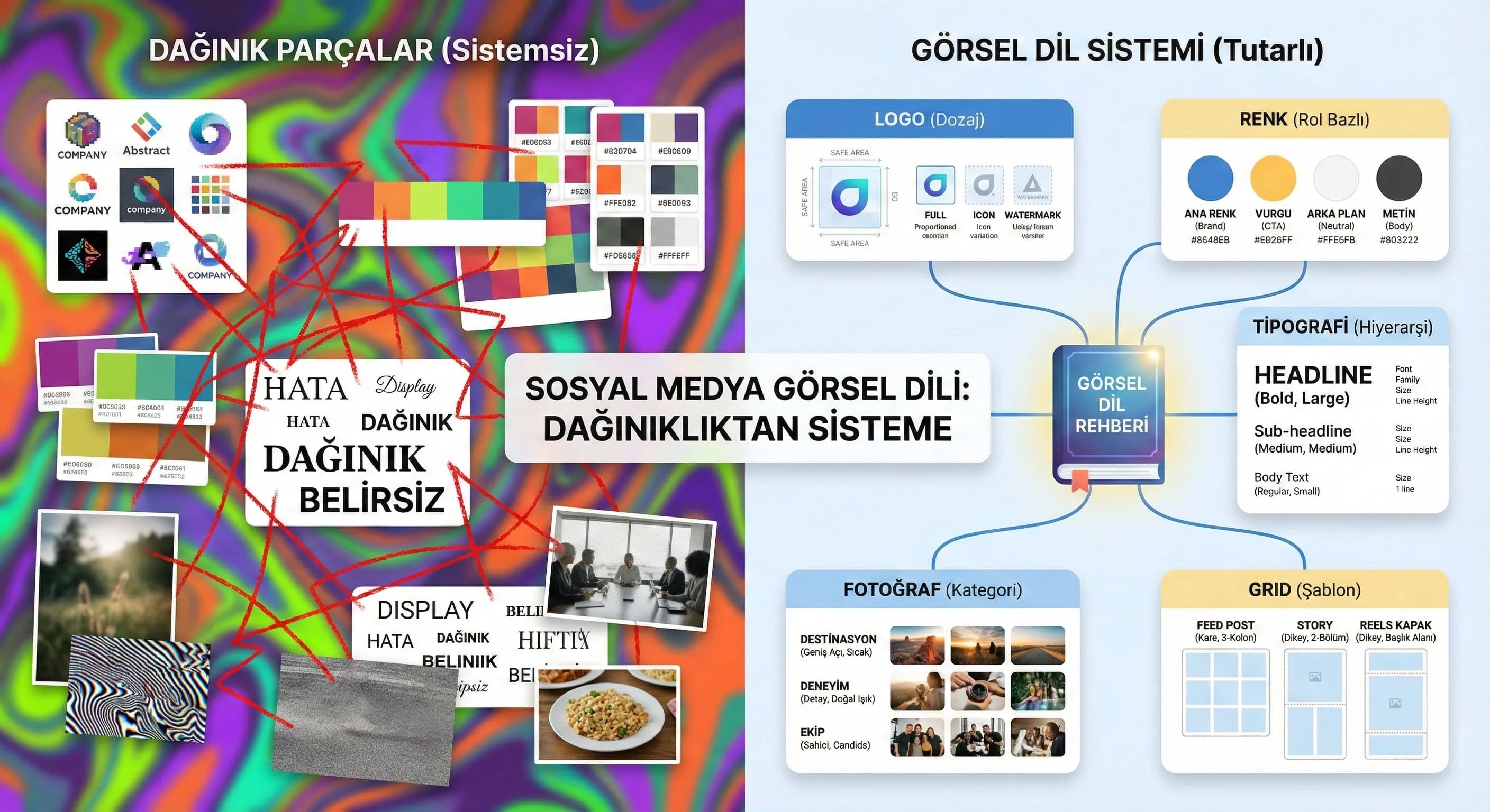
2. Visual Language Components for Social Media
Social media visual language is not a “design set”; It is an operating system. The best system; Even when a new designer comes in, he produces the same quality. Below you will pin the components one by one and then see how to adapt the same model to hotel and B2B scenarios.
Logo Usage
The logo is not a stamp to be printed everywhere on social media; It is a dosage-managed signature. A large logo on every post spoils the aesthetics and weakens the message. Best practice: define logo usage based on format (feed, story, reels cover).
Logo Dosage Rules
- •Feed: Small in the corner, with a “safe area”
- •Story: Stronger in the last frame or highlight cover
- •Reels: Small on cover; If you need watermark in the video, minimal
What should I do?
- • Set minimum size + safe area size for the logo and embed it in the templates.
- • Write logo usage scenario for feed/story/reels: “where, how much, when?”.
- • Instead of making the logo bigger: increase recognition with headline hierarchy + brand color + typography.
- • Make a “logo panic” rule during campaign periods: campaign ≠ giant logo.
Color Palette
The color palette is two layers: core palette (brand color family) + support palette (campaign/season shades). Summer/winter season in hotel brands; In B2B, periodic changes such as product launches are managed in the "support" layer.
Color System (Practical Model)
- •Core: 2 main + 2 neutral (background/typography)
- •Support: 4–6 highlights (campaign, CTA, icon)
- •“Red line”: Contrast and accessibility
Mini Check
- • Is the same CTA color the same in every format?
- • Do background colors drown out text?
- • Does the color “shine” in the Story but fade out in the feed?
What should I do?
- • Define the palette as a usage role (CTA/Headline/Background/Badge), not as a “hex list”.
- • Show core and support colors on separate pages; Proportion support usage (e.g. 20% limit).
- • On the hotel side, use destination tones “limited” in the support palette; Do not add new tones to each post.
- • Standardize contrast testing in B2B: 2–3 background rule for dashboard image + text overlay.
typography
Typography is the “tone of voice” of the feed. Same message; It looks amateurish with the wrong font/hierarchy. Simplify typography on social media: 1 header font + 1 body font + clear size system.
Typography Hierarchy (Feed/Story)
- •H (Headline): 32–48 px (based on format)
- •Sub: 18–24 px
- •Body: 14–18 px (minimum readability in story)
- •Line spacing: focus on readability
What should I do?
- • Fix the “3 levels” rule: Do not open levels other than Headline/Sub/Body.
- • Do not pile long texts into a single image; Divide into carousel (1 idea = 1 slide).
- • Set a minimum readability measure for the Story (mobile testing: 1 meter rule).
- • When placing text on the dashboard in B2B, test the contrast with 2 variants (light/dark).
Icon and Illustration Style
Icons carry a “micro language”: line thickness, corner radius, fill ratio… All must be consistent. Icons experience in the hotel brand (spa, beach, room); In B2B, it describes the function (report, system, process).
Mini Check
- • Are the icons the same line thickness?
- • Is the solid icon mixed with the line icon?
- • Is illustration style colliding with photographic language?
What should I do?
- • Choose a single icon set (outline or filled) and don't mix it up.
- • Define the badge/tag system with icons (category + color + icon).
- • If you are going to use illustration, write the rule in the same post as the photo (e.g. 70% photo / 30% graphics).
- • Pin experience icons for hotel (spa/beach/kids/pool/food); Fix process icons for B2B (report/security/integration).
Language of Photography
Photography language; “what are we shooting?” as much as “how do we organize it?” is the question. Destination/room/experience in hotels; Team/product/dashboard in B2B. Even within the same category, if light, color, framing and space management are not standardized, the feed will become fragmented.
Hotel Photo Language (Destination/Room/Experience)
- •In resort areas such as Antalya/Belek: warm, spacious, wide angle but understated
- •Side/Kemer: nature/experience balance
- •Basement: minimalist, low contrast, “premium” tone
B2B Photo Language (Team/Product/Dashboard)
- •Team: natural, genuine, free from artificial "stock" feeling
- •Product: close-up + context of use
- •Dashboard: real screenshot + simple annotation
What should I do?
- • Identify 3 photo categories and write 3 rules for each (light/framing/color).
- • Fix the color scheme in one preset (2 variants: bright + premium).
- • Make preset mandatory in the feed; Even if “raw” is allowed in the story, set a minimum correction rule.
- • On the hotel side, manage the support tone change according to the season in the preset (do not search for new colors in each shot).
Using Grid and Space
The grid is the invisible backbone of the visual language. Whitespace is the fastest way to premium perception. Grid rules; It speeds up production, especially in carousel and story templates.
What should I do?
- • Create 2–3 basic templates: single image, carousel, story series (and the same grid logic for all).
- • Safe area, margins, secure text blocks; Do not leave any surprise margins.
- • Set a short title standard of 3–5 words on Reels covers.
- • Make Grid a “speed tool”: Production goal in 10 minutes (cover/quote/announcement).
3. Consistency Between Feed/Story/Reels
Most common mistake: feed is designed, story goes “daily”, reels covers remain random. However, the user sees the brand across channels. Consistency; The aim is not to make every format the same, but to differentiate them under the same system.
Feed Consistency: “9-view test”
In 9 view; Color rhythm, typographic weight and photo-graphic balance should be read. If there are 9 different design languages in 9 posts, the user will get the feeling that “the agency has changed”.
Story Consistency: “Series logic”
Story; fast production area but still requires templates. The 3-series model works well: 1) Hook — 2) Value — 3) CTA/next step.
Reels Consistency: Cover + Subtitle standard
The perception of reels often begins on the cover. Covers must come with the same grid and typography; Subtitles must be at the “tone of voice” standard.
Mini Check
- • Are reel covers from the same family as the feed?
- • Is the text size read in Story?
- • Does the CTA image have the same role in every format?
What should I do?
- • Type “minimum spec” for 3 formats (color role, font tier, grid, logo scenario).
- • Simplify Reels covers so that they can be produced in 10 minutes (single title + single grid).
- • Tie the Story series model to the weekly routine (e.g. Monday Hook, Wednesday Value, Friday CTA).
- • Do not break the core rules even during campaign periods; Solve with support palette + template variant.
4. Sample Style Guide Structure
Style guide; It doesn't have to be a 50-page brandbook. Best form for social media: 6–10 page implementation guide + template files. Purpose: “how did we decide?” To close the question and speed up production.
Style Guide Contents (Recommended)
- •Purpose & scope (which channels?)
- •Logo usage (safe area + example)
- •Color system (role based)
- •Typography (3 levels)
- •Grid & templates (feed/story/reels)
- •Photo language (preset + example)
- •Icon/illustration rules
- •Do/Don't (good/bad examples)
What should I do?
- • First remove the “quick spec”; then expand to a 6–10 page guide.
- • Deliver the guide with the template files (Figma/Canva links + usage note).
- • Enforce a Do/Don’t page to reduce revision (agency–client speak the same language).
- • Link to the “Content Production” guide to support your content production processes.
- • Refresh the guide with a 365-day cycle (season, campaign, new channel).
5. Visual Language Scenarios for Hotel and B2B
Same visual language model; It requires different “areas of emphasis” in different sectors. Emotion and experience in hotels; In B2B, clarity and trust dominate. The critical point here: defining sectoral variants in your visual language (but not disrupting the main DNA).
Hotel Scenario: Destination + Room + Experience Balance
- •Destination: “Spacious feeling” and warm tones in areas such as Antalya/Belek
- •Room: detail + comfort indicators (light, textiles, layout)
- •Experience: spa, restaurant, event; Categorized by icon/tag system
Hypothesis: After consistent visual language implementation in hotel brands, creative production time is reduced by 20–30%; the number of revisions decreases (especially during campaign periods).
B2B Scenario: Team + Product + Dashboard Clarity
- •Team visuals: trust and authenticity
- •Product: minimal diagram/icon explaining “what it does”
- •Dashboard: readable annotation + single CTA
How to prepare a social media style guide for hotel and B2B brands?
The obvious answer: Use the same backbone (logo–color–typography–photo–grid), then vary photo language and templates according to industry. Experience categories come to the fore in hotels, and product/process diagrams come to the fore in B2B; However, the core color and typography do not change.
What should I do?
- • Establish a “one guide + two variants” approach (Hotel/B2B): photo language + templates variant, core rules constant.
- • Use the Support palette for the season/campaign; Never change the core palette.
- • Create 3 templates for each scenario: feed post, story serial, reels cover.
- • Link your graphics & motion needs to the service page.
- • To reduce team dependency: install template + quick spec + approval flow trio at the same time.
Internal link: /creative/graphic-motion-design
6. Conclusion and Implementation Plan
Visual language; It is not a “design job” but a brand operation. A well-established visual language; It accelerates content production, reduces team decision fatigue and unifies brand perception. Once you set up this guide and update it at least once a year (with rebranding, seasonal concept, new channel additions), your social media production turns into a “sustainable system”.
What should I do?
- • Start with a 14-day sprint plan: rules first, then template, then pilot content.
- • Track post-pilot KPIs: production time, number of revisions, approval time (fastest win).
- • After the system is established: perform a "9-feed audit" routine once a month.
- • When changing seasons/campaigns, just change the support palette + message template; Do not disrupt DNA.
7. Download Brand Visual Language & Feed Consistency Checklist — Creative / Social Media Visual Language (v1.0)
Download Brand Visual Language & Feed Consistency Checklist — Creative / Social Media Visual Language (v1.0)
This asset is prepared for you to quickly control and standardize your social media visual language on the axis of logo-color-typography-photo-grid. With a 14-day sprint plan, it clarifies the task distribution within the team and shortens the "revision cycle". You can create variants for hotel and B2B scenarios while maintaining the same backbone.
Kim Kullanır?
Social media manager, designer, agency manager and brand/marketing decision maker.
Nasıl Kullanılır?
- Collect current feed: Bring together the last 30 posts + story samples + reels covers.
- Fill in the Checklist: Prioritize issues with Red/Yellow/Green and score.
- Apply to Sprint: Set up templates, preset and approval flow in 14 days; Then move on to content production.
Ölçüm & Önceliklendirme (Kısa sürüm)
- ▢ ✅ Logo safe-area and minimum size defined
- ▢ ✅ Logo usage scenario (feed/story/reels) net
- ▢ ✅ A distinction was made between core palette + support palette
- ▢ ✅ CTA color fixed based on role
- ▢ ✅ Typography has 3 levels (Headline/Sub/Body) rule
- ▢ ✅ Photo language: Hotel (destination/room/experience) defined
- ▢ ✅ Photo language: B2B (team/product/dashboard) defined
- ▢ ✅ Grid: 2–3 basic templates identified
- ▢ ✅ Icon set fixed to single style (outline/filled)
- ▢ ✅ Do/Don't samples produced
- ▢ ✅ There is rhythm in the 9-feed test
- ▢ ✅ Story serial model (Hook/Value/CTA) standard
- ▢ ✅ Reels covers with the same grid and typography
- ▢ ✅ Core rules are not violated during campaign periods
- ▢ ✅ The approval process is managed with “quick spec”
PDF içinde: Problem→Kök Neden→Çözüm tablosu + 14 gün sprint planı + önce/sonra KPI tablosu
Bir Sonraki Adım
We quickly map your current feed and prioritize logo/color/typography/photo/grid errors.
Frequently Asked Questions
What is brand visual language and why is it important for social media?▾
How to ensure color and typography consistency in the feed?▾
How to prepare a social media style guide for hotel and B2B brands?▾
How to manage logo, icon and photo language at the same time?▾
Why do Reels covers appear disconnected from the feed?▾
How many pages should the style guide be? Is a brandbook necessary?▾
Does consistent visual language increase engagement?▾
İlgili İçerikler