
1. Speed up mobile booking with mobile-first UI/UX
Reservation experience on mobile; It is gained through speed, clarity and one-handed operation. This guide explains how to build mobile-first UI/UX on hotel sites; It handles thumb-zone CTA, sticky reservation bar, short form/payment design and measurement-improvement cycle through Core Web Vitals (LCP/CLS/INP).
- •On mobile, the expectation of “one-handed use + quick decisions” is high; CTA and navigation should be positioned accordingly.
- •When performance (LCP/CLS/INP) deteriorates on mobile, not only speed but also perception of trust decreases.
- •Hotel booking is a “high intent” flow; Even minor friction can lead to payment abandonment.
2. What should mobile-first UX be like for hotel websites?
Mobile-first hotel UX; It doesn't mean "minimizing the desktop", but reordering priorities according to actual usage behavior on mobile. On mobile, the user generally navigates in short sessions, with divided attention, and with one hand; Therefore, the interface should work on the principle of “fewer options, clearer guidance”. The ideal approach: (1) put the most critical action (reservation) in the thumb-zone, (2) keep navigation to a minimum, (3) shorten the form and payment steps, (4) constantly monitor and improve performance with CWV.
Mobile-first ≠ responsive only
Responsive design fits the screen; mobile-first focuses on "the most critical job in mobile". For example, on the room list screen on mobile; filter, price clarity, cancellation policy and CTA take priority. On desktop, tolerance for detail increases, but on mobile, if the "decision information" does not appear on the first screen, the user will scroll.
One-handed use (thumb zone) is a design rule
The thumb reach is the “natural zone” for CTA and main navigation. Hiding the CTA at the top makes conversion unnecessarily difficult. Especially for resort users, the "select date - see price" action should work in the lower area, with a single touch.
Mini Check (H2-1)
- • Is the main CTA (Select Reservation / Date) in the thumb-zone on mobile?
- • Is there price/condition clarity on the first screen (taxes, cancellation summary)?
- • Does navigation exceed level 1–2? (if it passes, it should simplify)
- • Does "decision information" appear on the first screen in the room list?
What should I do?
- • Define the mobile main goal in one sentence: “Select date → availability → select room → pay”.
- • Move CTA to thumb-zone; Reduce dependence on parent menu.
- • Simplify room cards by decision information (cancellation + total price + 3 differences).
- • Standardize separate tracking of Core Web Vitals metrics (LCP/CLS/INP) on mobile.
3. Booking behavior on mobile (resort, city, boutique difference)
Mobile booking behavior varies depending on the hotel's concept. In resort hotels, the user comes with a “package/concept” and family needs; In city hotels, speed and location are priorities; Visual trust and story effects are great in boutique hotels. If you don't read this difference correctly, the "uniform mobile interface" will be a well-intentioned but weak template.
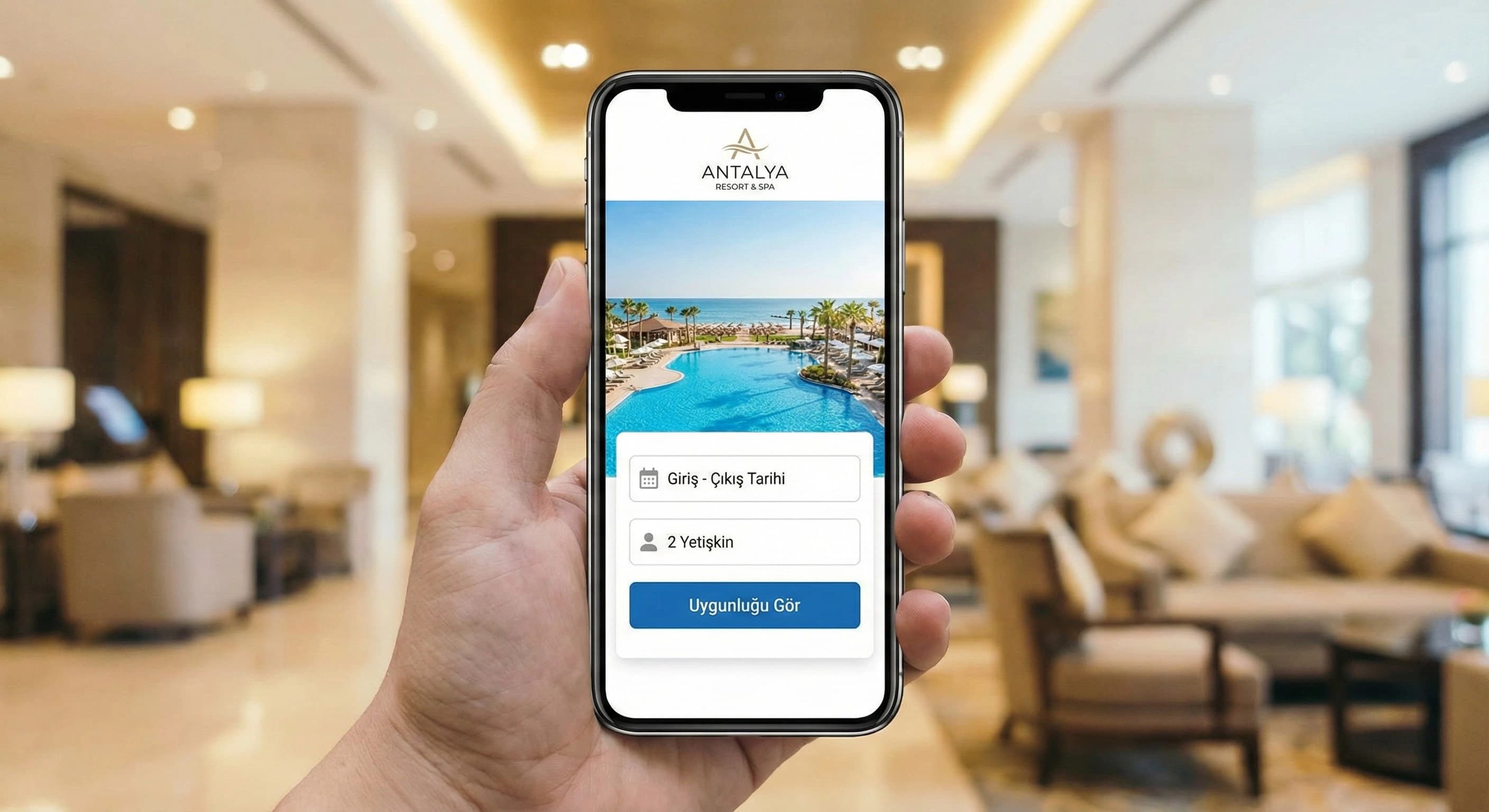
Resort destination scenario (Antalya/Belek)
Mobile travel for a resort in Belek is generally a “family decision”: 2 adults + child age, concept (AI/HB), cancellation flexibility. User will fall back to OTA if “child policy” and “total price” are not clear. That's why on mobile; The contact selector, concept information, cancellation summary, and trust signal should appear earlier.
City hotel scenario
In City hotel the user makes quick decisions on mobile: location, transportation, single night/business trip. Here the “sticky booking bar” and fast payment are more effective; Details are secondary.
Boutique hotel scenario (Bodrum)
In a boutique hotel, visual and trust are the primary factors on mobile. Photo quality, reviews and clear cancellation policy carry much of the decision. On mobile, the “gallery + room summary + trust” blocks must be placed in the correct order.
Key data point (softened usage): In most hotels, analytics show that mobile traffic can reach 60–80%; That's why mobile speed and simpler flow are practically one of the biggest levers driving transformation (varying by site, market and channel mix).
Mini Check (H2-2)
- • Is the person/child selection and concept clear in the resort flow?
- • Is there a “quick booking” way (sticky bar + short form) in the City stream?
- • Will the review/trust and cancellation summary appear in the boutique feed?
- • Can the “total price” (including taxes) be understood in a single line on mobile?
What should I do?
- • 3 personas emerge: resort family / city business / boutique experience; Sort mobile screens accordingly.
- • Move “decision information” to the first screen: cancellation, total price, concept, review.
- • Design room list and room detail screens separately on mobile (do not bloat the same page).
- • Set up mobile measurement (GA4 events) step by step: date selection → room selection → form → payment.
5. Mobile form and payment experience (short form + trust + speed)
Form on mobile is one of the biggest reasons for abandonment. If the user has selected a room, it now prompts for “easy completion”; Redundant fields and vague error messages increase payment abandonment. Trust elements (cancellation policy, secure payment, confidentiality) also play a critical role in the hotel.
Split form fields into two: “now” and “then”
Most of the time, name/surname, e-mail and telephone are sufficient to complete the reservation. Fields such as identification information, special requests, and transfer details can be collected “later”. This approach supports completion rate on mobile.
Microcopy (“short + clear” on mobile)
- •“Total price (including taxes)”
- •“Free cancellation until X date” (if applicable)
- •“Secure payment (SSL) – your card information is protected”
Checkout step: balance of trust and friction
On the payment screen, the user should not get lost in the “last step”. Cancellation summary and secure payment text must be visible; A short preparatory sentence should be added to the steps such as 3DS.
Mini Check (H2-4)
- • Are mobile form fields minimal (are mandatory fields really mandatory)?
- • Do error messages tell you a solution (do they give a format example)?
- • Is there 1–2 lines of cancellation summary on the payment screen?
- • Is the secure payment text clear and “calm” (no badge spam)?
What should I do?
- • Cut form fields in half; Separate “to collect later” areas.
- • Convert error messages to “how to fix” format.
- • Add 2 trust elements + 1 line cancellation summary to the payment screen.
- • Measure booking flow by event (GA4) and correct a single friction every 14 days.
6. Mobile performance, Core Web Vitals and UX relationship (CWV → trust → conversion)
The “secret engine” of mobile-first UX is performance. If the page is slow on mobile, the user doesn't just wait; trust also decreases: “Is the payment secure, is the site healthy?” That's why Core Web Vitals (LCP/CLS/INP) metrics should be talked about in the same sentence as UX and Conversion Rate. The goal here is not “one-time speed”; It is a continuous improvement cycle.
Interpreting LCP/CLS/INP in a hotel context
- •LCP (Largest Contentful Paint): If the hero image, gallery or large room photo arrives late on mobile, the user feels "site heavy".
- •CLS (Cumulative Layout Shift): If room cards shift, price/CTA moves, user clicks wrong and gets angry.
- •INP (Interaction to Next Paint): If the filter, date selector, person selector is delayed, the reservation flow will be blocked.
Visual/video usage on mobile: right place, right load
Hotel sites are visual-oriented; But the mobile-first rule is this: “visual quality” and “load performance” are planned together. Lazy-loading, right-sizing, prioritizing critical images and reducing unnecessary scripts significantly improve the mobile experience.
| Metric | UX symptom seen on mobile | Practical solution for hotel sites |
|---|---|---|
| LCP | The first screen opens late, the user does not wait | Optimize hero image, reduce critical CSS/JS, right-size image |
| CLS | Price/CTA scrolls, wrong click occurs | Give fixed size to images, use font/placeholder, control slow loading banners |
| INP | Date/person picker reacts slowly | Reduce heavy scripts, optimize interaction components, simplify third-party tags |
Mini Check (H2-5)
- • Is the element (hero/gallery) that increases LCP on mobile optimized?
- • Have CLS sources been detected (sliding price/CTA)?
- • Are the interactions (calendar/filter) that disrupt INP simple?
- • Are lazy-load images implemented correctly (isn't the critical image delayed)?
What should I do?
- • Routine mobile CWV measurement: LCP/CLS/INP weekly check + monthly sprint.
- • Make room list and gallery pages performance priority (visual weight).
- • Simplify third-party tags; Do not run unnecessary script during the reservation step.
- • Provide internal links to technical SEO content: /seo/technical-seo
7. Scannable closing with mobile UX checklist (quick app)
The goal of this article is; It is not about “perfect design”, but about making the reservation faster and safer on mobile. By applying the checklist below in 15 minutes, you can create the first sprint backlog.
- •Is the CTA in the thumb-zone?
- •Is there a sticky booking bar and is it the only CTA?
- •Room card: total price + cancellation + 3 differences clear?
- •Are form fields minimal?
- •Does the payment screen include a trust + cancellation summary?
- •Is CWV (LCP/CLS/INP) tracked on mobile?
Internal link (mandatory): From this content, link to the /hotel-digital-marketing page with the “mobile booking experience” anchor.
8. Download Core Web Vitals & UX Mini Report — Mobile-First Hotel UX
Download Core Web Vitals & UX Mini Report — Mobile-First Hotel UX (v1.0)
This mini report allows you to detect CWV (LCP/CLS/INP) problems that disrupt the mobile experience on your hotel website on a “screen-based basis” and prioritize them along with user friction and conversion impact. Aim; "What should I fix on which page?" without leaving technical metrics abstract. is to answer the question clearly. The output is designed to become a 14-day sprint plan.
Kim Kullanır?
Hotel marketing team + agency + software/technical team (for common language).
Nasıl Kullanılır?
- On mobile, select the 3 critical pages: Home / Room list / Room detail – reservation.
- For each page, score the CWV + UX observation (0–5) and annotate R/Y/G.
- Make the “top 10 actions” list and implement it in a sprint every 14 days; Verify with GA4 drop-off.
Ölçüm & Önceliklendirme (Kısa sürüm)
- ▢ ✅ Page 1 (Room list): LCP/CLS/INP + UX friction scored
- ▢ ✅ Page 2 (Room detail): gallery, sticky bar and confidence blocks checked
- ▢ ✅ Page 3 (Reservation/payment): form fields, error message and 3DS friction scanned
- ▢ ✅ Added Red/Yellow/Green notes
- ▢ ✅ Top 10 action backlogs extracted
- ▢ ✅ Before/After KPI fields filled (Conversion Rate, drop-off, CWV status)
PDF içinde: Problem→Kök Neden→Çözüm tablosu + 14 gün sprint planı + önce/sonra KPI tablosu
Bir Sonraki Adım
Find points of loss in the mobile booking flow and create a clear improvement plan for your hotel team.
Frequently Asked Questions
How to design my hotel website mobile-first?▾
How do I improve the mobile booking experience?▾
How does Core Web Vitals impact hotel UX?▾
How to use the sticky reservation button on mobile?▾
“Why do I have difficulty booking a hotel from my phone?”▾
Which is more critical, the mobile room list or the room detail?▾
What should I pay attention to on the hotel site for mobile-first indexing?▾
İlgili İçerikler