1. Choosing Color and Typography: A Practical Guide for Brands
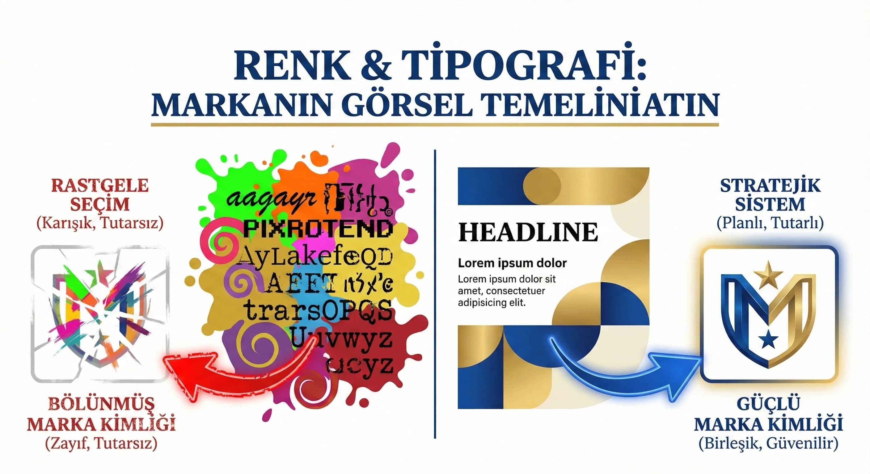
The feeling a brand gives at first “eye contact” is often created by color and typography before the text. Here's the problem: many teams make this selection by "like"; Then the web, social media and offline materials become disconnected and the revisions never end. This guide; It allows you to establish a simple but powerful system with 1 main + 2 support colors and 1–2 fonts based on sector, target audience and positioning; makes it applicable with hotel and B2B examples.
2. Color Psychology and Brand Perception
Color psychology does not mean attributing "one meaning to each color"; It works with context, culture and industry. Same blue; It may evoke "calmness" in a hotel and "trust" in B2B; But choosing the wrong tone and contrast can also create a "cheap" perception. That's why the color decision should be based on positioning and persona, not "trend".
How to choose the right color palette for the brand?
Straightforward answer: First clarify the positioning (premium, family, hipster?), then choose 1 main + 2 support colors based on role (CTA, background, highlight), lastly test for contrast and accessibility. Palette should be a usage rule, not a “hex list”.
- •What is your brand “premium/casual/energetic/corporate”? (in one word)
- •Will the main color be used in the CTA or only for brand emphasis?
- •Is the background–text contrast read everywhere?
What should I do?
- • 1. Describe the brand in 1 sentence: “For whom, what benefit, what feeling?”
- • 2. Set the main color as the “role” (CTA or highlight?).
- • 3. Support functional select colors (badge, link, background).
- • 4. Last step: run the contrast tests and write the rule set.
3. How to Set Up a Master/Color Palette?
The practical way to set up a pallet is to use two layers: Core (brand) + Support (function). Core colors convey brand identity; Support colors serve UI/CTA and content types. The industry difference appears here: “atmosphere” in the hotel; In B2B, “clarity” is dominant.
Pallet Skeleton (Plain Model)
- •1 Primary colour: Brand signal (primary)
- •2 Support color:
- •Support-1: CTA/Link (action)
- •Support-2: Badge/Info (info)
- •Neutrals: Background + text + surface (2–3 tones)
Warm/Cool Tones and Industry Compatibility
- •Hotel: warm tones can convey “hospitality”, cool tones can convey “comfort/coolness”
- •B2B: cool/neutral tones signal “confidence”, accent colors signal “innovation”
What should I do?
- • 1. Write the palette as a “role table”: CTA, link, background, badge.
- • 2. Keep seasonal colors limited to the support tier (campaign period).
- • 3. Pin the same palette to web + social + presentation templates.
4. Typography Hierarchy (Heading–Body–Emphasis)
Typography; It's "how you say it" as much as "what you say". Strong hierarchy; It tells the user where to start and what to consider important. The biggest mistake: using too many fonts or writing with the same weight everywhere.
What should be considered when choosing a title and body font?
Clear answer: Title font conveys character, body font conveys readability. Choose the two compatible; Use a font with high screen readability in the body; Do not exceed 2 fonts. Standardize weight and letter spacing according to hierarchy.
“Two Font Rule” (Key Practice)
- •1 title font: brand tone
- •1 body font: high readability
- •Open a new font for emphasis; use weight/italics/color
- •Does body text read around 16px on mobile?
- •Is there clear contrast between title and body?
- •Do you use more than 3 font weights? (usually error)
What should I do?
- • 1. Fix H1/H2/H3 + body dimensions in 3 levels.
- • 2. Use “less but more effective” headline font.
- • 3. Manage emphasis without changing font (bold/color/space).
5. Screen Readability and Weight/Kerning
Typography on screen; It works differently than printed work. Thin fonts are lost on mobile, tight kerning reduces readability. The aim here is not to produce "stylish" text, but to produce text that is readable and quick to scan.
Readability Practices
- •Body: 16–18px (mobile priority)
- •Line spacing: relaxed (make text breathe)
- •Weight: 400–500 bodies, 600–700 heads (enough in most scenarios)
- •Letter spacing: minor adjustment (exaggeration)
What should I do?
- • 1. Test 3 screens on mobile: home page, service page, blog.
- • 2. Use very thin fonts (light) only in large headings.
- • 3. Excessive letter spacing on CTA buttons.
6. Sample Palette & Font Combinations for Hotel and B2B
The purpose of this section is not to give “the only correct palette”; to exemplify the decision model. Concept (premium/comfort/family) and destination feeling in the hotel; In B2B, industry (SaaS/enterprise) and persona (CEO/CMO/operations) set the tone.
Hotel Examples (Concept Based)
- •Premium: neutral + low saturated highlight; strong headline in typography
- •Casual/Resort: warm neutral + soft accent; fluid reading in body
- •Family: more energetic emphasis; but still control (no noise)
Assumption: In resort areas such as Antalya/Belek, the perception of "spaciousness and premium" gives better performance than oversaturated colors.
B2B Examples (Persona Based)
- •Corporate: strong neutrals + limited emphasis
- •Digital/SaaS: sharper contrast + modern typography
- •Innovative: highlight color distinct; but controlled in UI
What are sample color & font combinations for hotel and B2B?
Clear answer: Change the saturation and neutral weight of the palette according to the premium/casual/family concept in the hotel; Balance trust (neutral/cold) + innovation (emphasis) in B2B. The approach of 1 main + 2 support colors and 1 heading + 1 body font on both sides provides consistency.
What should I do?
- • 1. Put the concept/persona in writing.
- • 2. Secure the palette with role-based table.
- • 3. Connect typography hierarchy to components (web + social template).
- • 4. Connect to the relevant page for the UI/UX application. (Internal link: /creative/ui-ux-design)
7. Conclusion and Implementation Plan
Color and typography; It is the “cornerstone” of brand consistency. When these two are systematized, the design decision time in new page and campaign production is shortened, revision is reduced, and the same feeling is maintained in all channels. With the mockup in this guide, first set up the decision framework, then embed the palette and typography into the templates; Keep the system alive by updating it (trends/accessibility) at least once a year.
8. Download Brand Color & Typography Selection Checklist — Creative / Design Basics
Download Brand Color & Typography Selection Checklist — Creative / Design Basics (v1.0)
This asset has been prepared for you to decide on color and typography based on positioning + persona + accessibility rather than "likes". It helps you quickly set up a 1 main + 2 support color and 1 heading + 1 body font system. Standardizes implementation to web and social templates with a 14-day sprint plan.
Kim Kullanır?
Brand manager, marketing team, UI/UX designer, agency and content teams.
Nasıl Kullanılır?
- Clarify positioning and persona in 1 sentence.
- Select the palette by role (CTA/background/highlight) and check the contrast.
- Establish the typography hierarchy and apply it to templates with a 14-day sprint.
Ölçüm & Önceliklendirme (Kısa sürüm)
- ▢ ✅ Positioning & Persona: Is the brand tone simply clear? (premium/casual/corporate/innovative)
- ▢ ✅ Positioning & Persona: Is the target audience/persona written?
- ▢ ✅ Positioning & Persona: Are the channels clear? (web/social/offline)
- ▢ ✅ Color Palette: Is the main color role clear? (brand or CTA?)
- ▢ ✅ Color Palette: Is Support-1 defined for CTA/link?
- ▢ ✅ Color Palette: Defined for Support-2 badge/info?
- ▢ ✅ Color Palette: Are neutrals (background/surface/text) separated?
- ▢ ✅ Color Palette: Are season/campaign colors in the support layer?
- ▢ ✅ Contrast & Accessibility: Is text–background contrast readable?
- ▢ ✅ Contrast & Accessibility: Is the CTA button text read on all surfaces?
- ▢ ✅ Contrast & Accessibility: Don't colors provide information “just by color”? (is there icon/tag support?)
- ▢ ✅ Typography: No more than 2 fonts?
- ▢ ✅ Typography: Is the H1/H2/H3 + body hierarchy fixed?
- ▢ ✅ Typography: Is the body 16–18px readable on mobile?
- ▢ ✅ Typography: Are the weights under control (not too much weight)?
- ▢ ✅ Score (Assumption: 0–2) — 0: none — 1: partial — 2: clear/applied
PDF içinde: Problem→Kök Neden→Çözüm tablosu + 14 gün sprint planı + önce/sonra KPI tablosu
Bir Sonraki Adım
(Let's check your current color/font set in terms of sector-persona-positioning and create a 2-week implementation plan.)
İlgili İçerikler
İlgili Yazılar